Are You Erasing Products Shoppers Actually Wanted?
Imagine it is a Tuesday afternoon. You are managing a mid-sized WooCommerce store selling premium leather bags. You have just restocked the “Midnight Black” colorway of your best-selling satchel, and you want to announce it on Instagram. So you open your store to grab the link. And there it is — or rather, there it isn’t.
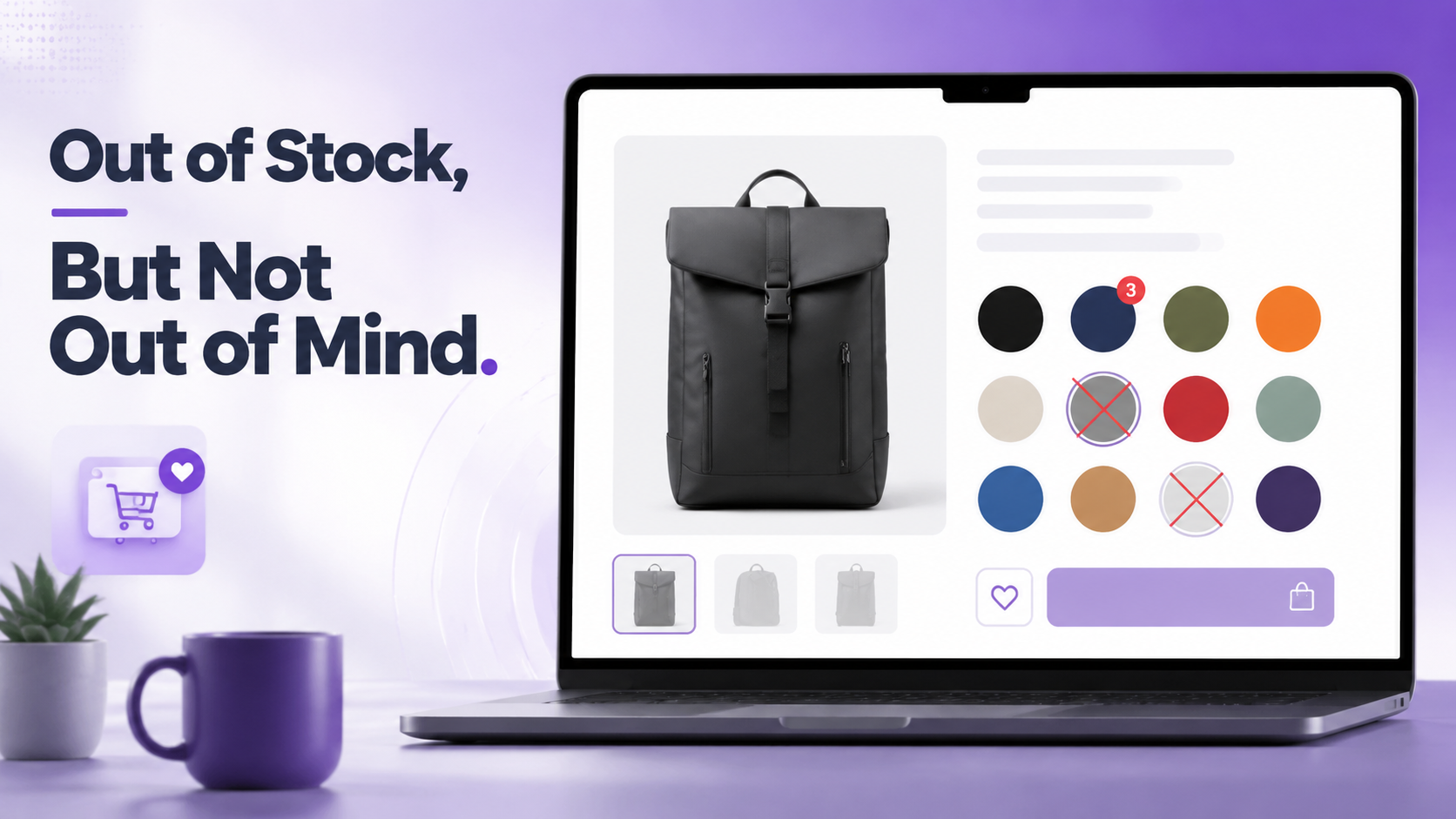
The Midnight Black swatch has vanished from the product page. Gone. No visual trace that it ever existed. A shopper who saw your post and typed “midnight black satchel” into your search bar would find no color option matching that description on the product page. The entire variation had been invisible for the three weeks it was out of stock.
You had configured the store to disable and hide out of stock variation swatches. The logic seemed sound at the time: why show something people can’t buy? It felt clean. Efficient. Customer-friendly, even.
It was none of those things.
In reality, every shopper who had seen that color on a friend’s shoulder, every visitor who arrived from a review page that mentioned “the black version,” every return customer who wanted to gift it — they had all landed on a product page that silently said: this color does not exist.
This is not an unusual story. It plays out quietly on thousands of WooCommerce stores every single day. A configuration toggle, made with good intentions, creates an invisible but persistent drain on revenue, on brand perception, and on the relationship between your store and the shoppers who are actively trying to give you money.
This article is about fixing that. Specifically, it explains:
Hiding out of stock swatches is the eCommerce equivalent of pulling a product off the shelf and hoping customers stop wanting it.
The Psychology Behind Out of Stock Visibility
To understand why showing out of stock WooCommerce variation swatches almost always outperforms hiding them, you need to understand three psychological phenomena that govern how people shop online.
The Perception of Range
When a shopper lands on a product page, they form an immediate impression of the store’s breadth and quality based on how many options they can see. A product page showing eight color swatches — even if three are currently unavailable — signals a robust, serious product line. The same page with only five visible swatches feels like a limited offering.
This perception affects purchase intent even for the items that are available. A store that appears to carry a comprehensive range earns more trust, commands higher perceived value, and encourages larger basket sizes. Hiding out of stock options actively shrinks this impression.
Scarcity and the Fear of Missing Out
Behavioral economics has consistently shown that scarcity increases desire. When a shopper sees a visually muted swatch — a grayed-out Navy, a blurred Crimson, a crossed-out Forest Green — their brain registers that item as something rare, something other people have bought, something worth wanting. The swatch that says “unavailable right now” is actually whispering: someone chose this before you.
This is why luxury brands never pretend a sold-out item never existed. They display it, crossed out or tagged “sold,” because the absence of availability is itself a sales signal for everything around it.
Decision Anchoring and Comparison
Shoppers rarely evaluate a single option in isolation. They compare. When all available options are visible, a shopper who cannot get their first choice will naturally evaluate their second. When the first choice has been silently removed, the shopper has no frame of reference — the remaining options lack the context that made them feel like smart alternatives. The result is a lower likelihood of purchasing anything at all.
Research in consumer behavior consistently shows that presenting unavailable options alongside available ones — when done with clear visual signaling — increases overall conversion rates compared to showing only available options. The mechanism is comparison: shoppers feel they’re making a more informed, confident choice when they can see what they’re not choosing.
What Hiding Out of Stock Variations Actually Costs You
The damage from hiding out of stock variation swatches operates on several levels, and most of them are invisible in your analytics — which is precisely why so many store owners never fix it.
Lost Back-in-Stock Intent
A shopper who sees a blurred or crossed-out swatch knows exactly what to search for when they return. They might bookmark the page, sign up for restock notifications, or simply come back in a week. A shopper who sees no swatch has no idea the variant exists at all — there is nothing to remember, nothing to search for, no reason to return specifically for that item.
Broken External Traffic
When you run ads, share links on social media, or appear in a Google Shopping listing for a specific product variation, that traffic expects to find that variation on your page. If the variation’s out of stock and hidden, those visitors land on a page that appears to not carry what they came for. The bounce is immediate. The ranking signal is negative.
Corrupted Product Page UX
Imagine a product page that shows four colors in January, seven in March, and five in April — depending entirely on what happens to be in stock. The product page becomes unstable, inconsistent, and untrustworthy. Regular customers notice the variations. It looks like your store is in trouble, or that the product line has been scaled back.
SEO Damage from Inconsistent Variation URLs
Smart Swatches plugin’s Generate Variation URL feature creates unique, shareable URLs for each product variation. These URLs can be indexed. When a variation disappears from the page (because its swatch was hidden), any inbound links to that variation URL land on a page where the variation is no longer accessible. This breaks the user experience and wastes accumulated link equity.
If you have the “Disable Out of Stock Attribute” toggle turned on in Smart Swatches (Settings → General), your store is currently hiding all out of stock swatches. This is not the default setting — the plugin ships with this disabled (swatches remain visible) — but it’s worth checking immediately if you or a previous developer configured it.
The Visual Signals That Keep Shoppers Engaged
Smart Swatches provides a nuanced set of visual treatments for out of stock variation swatches. Instead of the binary choice of “show or hide,” you get a spectrum of signals — each communicating unavailability with a different tone and visual weight. Choosing the right one for your store is a design decision that shapes how shoppers perceive your brand.
Option 1: Blur
The default style in Smart Swatches. Out of stock swatches appear softened and faded — clearly not clickable, but still visible. Blur is the most gentle signal. It communicates “not right now” without alarm. Best for stores where a premium or aspirational tone is important, and where the out of stock status is likely temporary.
Option 2: Cross
A diagonal line is drawn across the swatch face, in a color you choose. Cross is the most immediately legible signal — there is no ambiguity. It is the universal “not available” symbol. Best for stores where absolute clarity is more important than aesthetics: functional goods, electronics accessories, workwear.
In Smart Swatches, the cross color is configurable to match your brand palette.
Option 3: Blur with Cross
The most comprehensive signal: a swatch that is both visually softened and marked with a cross. This combination leaves absolutely no room for misinterpretation — the swatch is present (so the shopper knows the variant exists), but the dual signals make unavailability unmistakable. Best for high-SKU stores or any product line where shoppers might accidentally select an out of stock variant without noticing the blur alone.
Option 4: Grayscale
Out of stock swatches are desaturated to grey tones. The shape, size, and position of the swatch is fully preserved; only the color information is removed. Grayscale is the most design-conscious option — it harmonizes with sophisticated visual identities and feels intentional rather than broken. It is the preferred choice for fashion, home goods, beauty, and any category where brand aesthetics are non-negotiable.
Option 5: Hide
Out of stock swatches are removed from the display entirely. As established throughout this article, this is generally the least recommended option — but it might be applied for specific use cases: stores with extremely high inventory turnover (where a missing swatch genuinely won’t be back), or stores where the out of stock items would create shopper confusion rather than desire (clearance stores, short-run limited editions that will never return).
The Secret Weapon: Variation Stock Info Badges
While the disabled-attribute styles handle the visual treatment of unavailable swatches, Smart Swatches adds a complementary feature that transforms how shoppers perceive the available ones: Variation Stock Info.
When this feature is enabled, each in-stock swatch displays a small badge showing its current stock quantity. A red swatch might show 3. A navy swatch might show 12. A green might show 1.
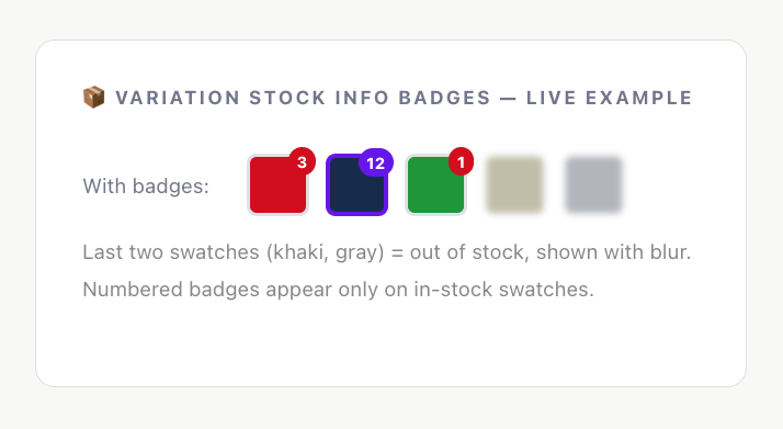
The psychological effect of this feature is profound, and it works on multiple levels simultaneously.
Scarcity for Conversion
A swatch showing “1” is an instant conversion accelerator. The shopper who was idly browsing becomes a shopper with a decision to make: buy now, or miss out. This is not manufactured urgency — it is transparent, honest inventory data that happens to align perfectly with how human decision-making works under scarcity.
Trust Through Transparency
Displaying real stock numbers builds credibility. Shoppers have been conditioned to distrust vague “Only a few left!” banners. Specific numbers — 3 remaining, 7 remaining — feel like genuine system data, not marketing copy. This transparency is a competitive differentiator in a landscape full of manipulative urgency tactics.
Guidance Without Pressure
When a shopper’s first-choice color shows “1” but their second choice shows “12,” they can make an informed decision — not a pressured one. The quantity information helps them navigate. This is particularly valuable in gift-buying scenarios, where the shopper’s own color preference may be secondary to what they know the recipient likes.
Use Variation Stock Info in combination with Blur disabled-attribute style for maximum effect: blurred swatches show shoppers what’s unavailable (scarcity signal), while numbered badges on available swatches show them what’s running low (urgency signal). Together, they create a product page that communicates the complete inventory story at a glance.
Which Disabled Attribute Style Should You Use?
The right choice depends on your product category, brand positioning, and the typical cognitive mode of your shoppers. Here is a practical decision framework.
Blur
Cross
Grayscale
Blur with Cross
THE 80% RULE : For the vast majority of WooCommerce stores — particularly those selling physical goods with regularly restocked inventory — the Blur style combined with Variation Stock Info is the highest-converting configuration. It communicates scarcity on unavailable items while driving urgency on items with low remaining stock. Start here and only deviate if your specific audience or product category demands something different.
Conclusion
Managing out-of-stock variations in WooCommerce is not complicated — but it does require making a few deliberate decisions rather than accepting the defaults without thinking about them.
The most important decision is the one that sounds counterintuitive: keep your out-of-stock swatches visible. A shopper who can see what they cannot have is far more engaged than one who sees a gap where something should be. Visibility keeps your catalog looking complete, creates genuine desire, and gives shoppers a reason to return when stock is replenished.
Beyond that, the choice of disabled attribute style is a design decision that reflects your brand. Blur is gentle and works everywhere. Cross is clear and unmistakable. Grayscale is elegant. Blur with Cross is comprehensive. Only Hide deserves a moment of hesitation — use it for items that are truly gone for good.
Still Have Questions?
Still unsure whether to show or hide stockout items?
We answer the frequently asked questions about out of stock variations in our comprehensive FAQ guide. Read the Frequently Asked Questions About Out of Stock Variations to discover how these inventory settings directly impact your store’s SEO, user experience, and conversion rates.
And if you have a question that is not covered here, our support team is one click away.
Leave a Reply