In this blog, I’ll share the best WordPress slider examples. Images, videos, posts, products, logos, customer reviews, or whatever you want to slide, this blog will help you find the most beautiful examples and get quick design ideas to craft stunning sliders for your website.
Sliders draw visitors’ attention and build strong connections with close interaction. Consequently, they can enhance visitor engagement and boost the conversion rate.
So, let’s get in.
What is a slider and a carousel?
A slider is an interface element that displays multiple images, videos, posts, and so on in a single place, one after another. If you enable autoplay, the content slides automatically. It also lets users navigate the remaining content by dragging the mouse, clicking arrows and dots, pressing arrow keys, and swiping (on touchscreens).
A slider is a sophisticated way to showcase your key content and grab visitors’ attention to boost conversion.
A slider is also known as a carousel. However, a slider displays only one piece of content at a time, while a carousel shows multiple pieces. That said, slider and carousel are often used interchangeably.
Let’s find the best WordPress slider examples below to create stunning sliders and carousels in minutes.
Best WordPress slider examples for inspiration
Simple slider
Simplicity is the best. A simple slider is an excellent option to display your items to draw the attention of your visitors and grow conversion.

10% border-radius slider
With a 10% corner radius, you can make your sliders look smoother and better.

50% border-radius slider
A 50% border-radius turns your square images into circles. If you want to display your items in circle shapes on the slider, you can simply add a 50% border radius.

Scrollbar pagination
Pagination is important to make users feel clear about the number of items on the slider and where they are now. In addition to dot pagination, you can choose scrollbar pagination as well.

Coverflow slider
In the Coverflow layout, items are displayed side by side, with one or two items prominently featured in the center. Users can navigate through the collection by scrolling horizontally.

Ken Burns sliding effect
The Ken Burns effect slowly zooms in or out of the image or video to make your sliders vivid and attractive. It’s named after the documentary filmmaker Ken Burns, who frequently used this technique in his films.

Flip sliding effect
In the Flip effect, when autoplay is enabled, or a user clicks, the slides flip vertically or horizontally to reveal the new content on the reverse side. This transition can give an impression, adding a playful and interactive element to the user experience.

Vertical carousel
Vertical sliders are stylish. Nowadays, many websites use these outstanding slider styles to set their displays apart from those of others.

Center mode carousel
The center mode carousel highlights an item when it comes in the center.

Ticker carousel
The ticker carousel is as beautiful as a river flow. It flows and flows to display slider items spontaneously.

Thumbnails slider
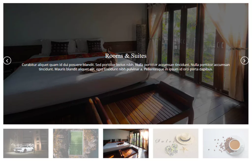
The thumbnail sliders let visitors see all the items at a glance in a little preview and easily navigate through the items. However, they take up additional places.

Multi-rows carousel
Most websites usually have single-row carousels. However, if there are many items, you can use multiple-row carousels.

Image carousel with watermark
If you do not want people to use your images without permission, you can protect them with a watermark.

Left to right
Generally, designers use the right-to-left direction. However, you can set slider directions from left to right as well.

Logo carousel
Businesses display the logos of their prominent clients, partners, sponsors, affiliates, reviewers, and others to gain credibility and build brand loyalty. Logo designers showcase the best logos they designed on their portfolio sites to show their creative power and attract more clients. All prefer sliders to create stunning logo showcases.

Review slider
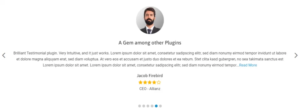
Customer reviews are like magical converting tools that make visitors feel confident in purchasing. So, highlighting customer reviews in beautiful sliders can significantly boost the conversion rate. Adding social proof links with reviews is a must to ensure transparency and gain credibility.

Post slider
You can create beautiful sliders to display blogs, articles, and any post. If designed properly, these can attract readers and significantly increase readability.

Product slider
Product sliders are attention-grabbing and interactive product displays that you can use to highlight your new arrivals, best sellers, top-rated products, or any group of products to boost sales.

Horizontal product gallery slider
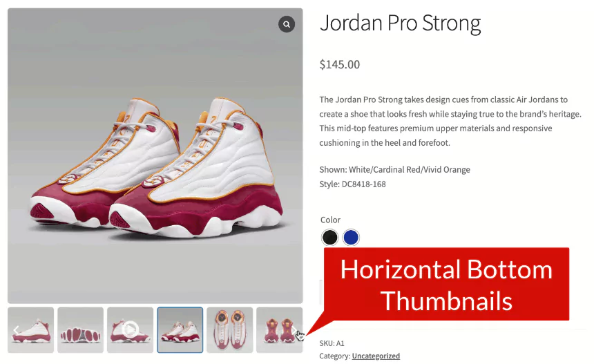
The product gallery slider shows multiple additional images and videos of a product on a single product page to provide a detailed display and persuade customers to buy.

Vertical product gallery slider
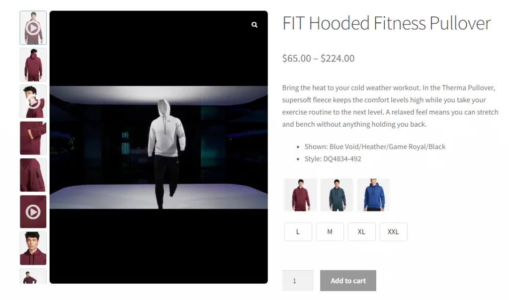
Vertical product slider is the current trend. You’ll see vertical product gallery sliders on the world’s top e-commerce sites like Amazon, Alibaba, Walmart, etc.

Team member slider
Team members are the heart of your business and organization. Displaying team members (employees, teachers, trainers, doctors, board members, and so on) is a common practice to show off your strength and earn trust.

To watch more WordPress slider examples, you can browse image slider examples, Upsell products slider examples, customer review sliders, and more.

Leave a Reply