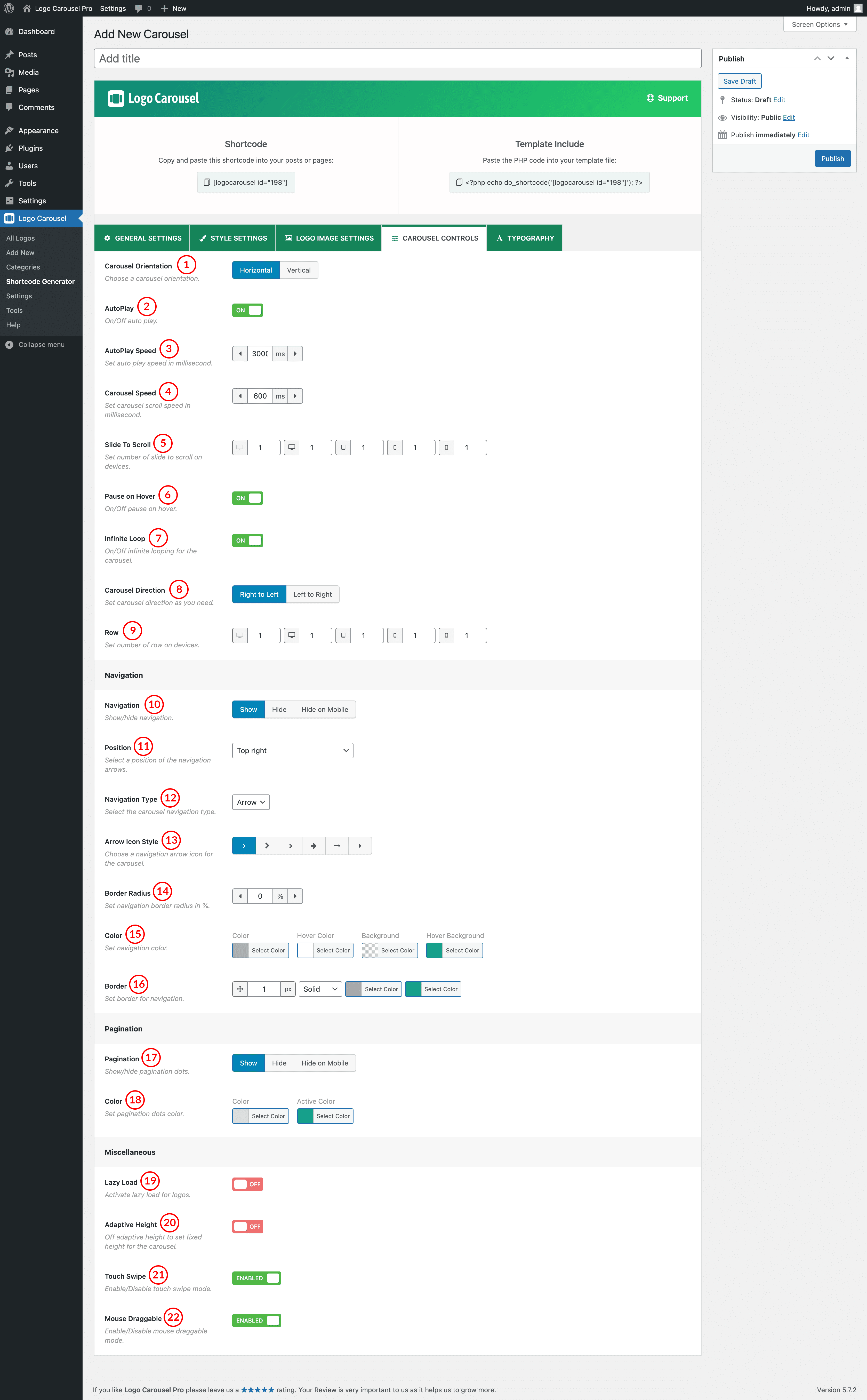
(1) Carousel Orientation: Choose a carousel orientation. It indicates how you want to display your carousel. Options are:
- Horizontal
- Vertical
(2) AutoPlay: When ON, the carousel will automatically start playing as soon as it could do so without stopping. With this feature, you can switch ON/OFF AutoPlay.
(3) AutoPlay Speed: Set auto-play speed in milliseconds. The default AutoPlay Speed is 3000 milliseconds. 1000 milliseconds is equivalent to 1 second.
(4) Carousel Speed: Set Carousel sliding or scrolling speed. The default value of carousel speed is 600ms.
(5) Slide to Scroll: This option is used to scroll/slide the Number of logos one after another on various devices. By default Slide to Scroll, value is set “1” for all devices. You can change the value as you want.
(6) Pause on Hover: Pause slider autoplay on hover. Options are ON and OFF. The default value is ON.
(7) Infinite Loop: If the feature is ON, then the slider will run continuously. If you have turned off this feature, the slider loop will stop after once.
(8) Carousel Direction: There are two kinds of directions in the plugin. In the RTL mode of the website, if you want to change the direction of the slider then just change the direction from this option.
- Right to Left: The carousel will start sliding Right to Left.
- Left to Right: The carousel will start sliding Left to Right.
(9) Row: Indicates how many rows will be shown in your logo carousel.
(10) Navigation: It helps users move from one slider image to another. There are three Navigation options.
- Show: Navigation will appear on every device.
- Hide: Navigation will not show on any devices.
- Hide on mobile: Navigation will only hide on mobile devices.
(11) Position: Select a Position for the Navigation Arrows. Available Options are:
- Top right
- Top center
- Top left
- Bottom Left
- Bottom center
- Bottom right
- Vertically center
- Vertically center inner
- Vertically center inner on hover
(12) Navigation Type: Select the carousel navigation type from Arrow and Text.
(13) Arrow Icon Style: You can choose one arrow Icon from 6 different icon styles.
(14) Border Radius: Set a Border Radius for the navigation icon as you wish. The default value is 0%.
(15) Color: Set navigation color, hover color, background, hover background, border and hover border, etc.
(16) Border: Set a border around the navigations using this option.
(17) Pagination Dots: Pagination indicates the active item which users see in the Carousel. There are three pagination options.
- Show: Pagination will appear on every device.
- Hide: Pagination will not show on any device.
- Hide on mobile: Pagination will only hide on mobile devices.
(18) Color: Set color for the carousel pagination dots. You can also set an active pagination dot color.
(19) Lazy Load: Lazy loading (also called on-demand loading) is an optimization technique for online content like a website or a web app. Instead of loading the entire web page and rendering it to the user in one go as in bulk loading, the content of the web page is loaded as and when the user scrolls down the page.
(20) Adaptive Height: The plan is to calculate all visible slide items and change the height according to the highest item. If this selection is on/enabled then each slide object will take the automated height in line with their content.
(21) Touch Swipe: Swiping in touch is the act of quick-shifting your finger throughout the touch surface in a certain direction. This feature will be available in the slider after keeping this option ON.
(22) Mouse Draggable: If the option is ON you can move the carousel item by clicking on it with the mouse and dragging it in a certain direction. You are allowed to ON/OFF the option.